A hotel brand redesigns its lobby. A luxury apartment developer wants every kitchen countertop to match a warm minimalist identity. A retail chain wants reception counters, wall panels, and display surfaces to support the same visual language across multiple stores. The brand team has color standards, the designer has mood boards, and the procurement team has one very practical concern: will the stone surface actually match the brand after production, shipping, cutting, and installation?
This is where Custom Stone Color becomes more than a decorative decision. In commercial interiors, stone color affects brand recognition, customer emotion, photography, lighting mood, long-term maintenance, and rollout consistency. Buyers selecting custom stone surfaces should start with brand identity, not only material names. If a project needs a consistent, clean, and repeatable color direction, engineered quartz and controlled surface materials can be more practical than natural stone that varies from slab to slab. For brand projects that require stable quartz surface options, pure color quartz slabs can be an effective starting point for controlled tone, clean design, and repeatable commercial specification.

What Is Custom Stone Color?
Custom Stone Color Explained for Commercial Buyers
Custom Stone Color refers to the process of selecting, matching, adjusting, or specifying the color direction of stone surfaces so they align with a project’s brand identity, design mood, and practical use conditions. It may involve choosing natural marble by tone range, developing engineered quartz colors, matching terrazzo base and aggregate combinations, selecting porcelain or sintered stone finishes, or controlling surface texture and gloss level.
Custom color does not always mean creating a completely new material from zero. In many commercial projects, it means controlling the right combination of base tone, veining intensity, finish, slab batch, edge appearance, and acceptable variation range. For a hotel, this may mean a warm beige quartz counter that matches the lobby lighting. For a retail brand, it may mean a consistent off-white surface that supports product display. For a restaurant chain, it may mean a darker counter surface that hides wear while matching brand atmosphere.
Custom Color vs. Natural Stone Variation
Natural marble, granite, quartzite, limestone, and travertine are formed by geological processes. Their colors and veins are naturally variable. This uniqueness can be beautiful, but it is not the same as controlled brand color matching. A small marble sample may show a soft grey vein, while the full slab may include stronger movement, warmer patches, or wider variation. That is not a defect; it is nature being nature, slightly dramatic as usual.
Engineered quartz, pure color quartz, porcelain, sintered stone, and terrazzo can usually offer more predictable color control. If strict repeatability is required across many locations, engineered materials often reduce risk. If natural luxury and uniqueness are part of the design story, natural stone can still work, but buyers must approve slab ranges instead of expecting paint-like uniformity.
Why Brand Identity Needs More Than “Nice Color”
Stone Surfaces as Brand Experience
Stone surfaces shape how people feel when they enter a space. White and light neutrals can create openness, cleanliness, and modern luxury. Grey stone can suggest calm, corporate stability, and architectural order. Beige and cream tones create hospitality warmth. Black stone adds contrast, drama, and premium positioning. Green stone can suggest wellness, nature, and boutique character.
The best color is not always the most beautiful color in isolation. It is the color that supports the brand’s emotional message. A luxury brand may need contrast and depth. A wellness brand may need soft green, cream, or warm neutral tones. A corporate office may need calm grey or refined white. A restaurant may need warmer surfaces that feel comfortable under evening lighting. Buyers selecting quartz and stone colors for residential or commercial projects can also review how to select the best quartz colors when they need practical guidance on tone, lighting, and interior coordination.
Color Consistency Across Multiple Locations
Commercial brands often need consistency across multiple locations. A hotel chain may want similar lobby counters in different cities. A retail brand may need the same display counter color in 20 stores. A restaurant group may want a recognizable bar counter material across different floor plans. This is where material standardization becomes important.
Buyers should document approved color, finish, thickness, slab size, edge detail, gloss level, maintenance method, and acceptable variation range. For repeat projects, a material standard library can prevent future confusion. Without documentation, each new project team may choose “similar beige” or “almost white,” and suddenly the brand identity starts looking like a family reunion where everyone wore different shades of cream.
The Psychology of Stone Colors in Commercial Interiors
White and Light Neutral Stone Colors
White and light neutral stone colors are popular because they create brightness, cleanliness, and a premium minimalist feeling. They work well in hotels, clinics, salons, retail stores, luxury apartment kitchens, office reception areas, and modern showrooms. However, they also require careful maintenance planning because stains, dark debris, and scratches may become more visible.
If the brand wants a clean and premium identity, white or off-white quartz may be suitable. If the space receives heavy traffic or food exposure, buyers should check stain resistance, cleaning method, and finish behavior. A beautiful white surface is not a maintenance strategy by itself. It needs practical backup.
Grey Stone Colors
Grey stone colors create calm, modern, and corporate interiors. They are useful in office lobbies, hotel corridors, commercial walls, apartment kitchens, and reception counters. Light grey can feel soft and architectural, while dark grey can feel more stable and formal. Grey also pairs well with black metal, brushed stainless steel, glass, walnut wood, and warm lighting.
The risk is that too much cool grey can feel cold or flat. To avoid this, designers often combine grey stone with warm lighting, wood details, textured walls, or soft furniture. If a brand wants a professional but welcoming atmosphere, grey should be balanced rather than used like concrete’s serious cousin.
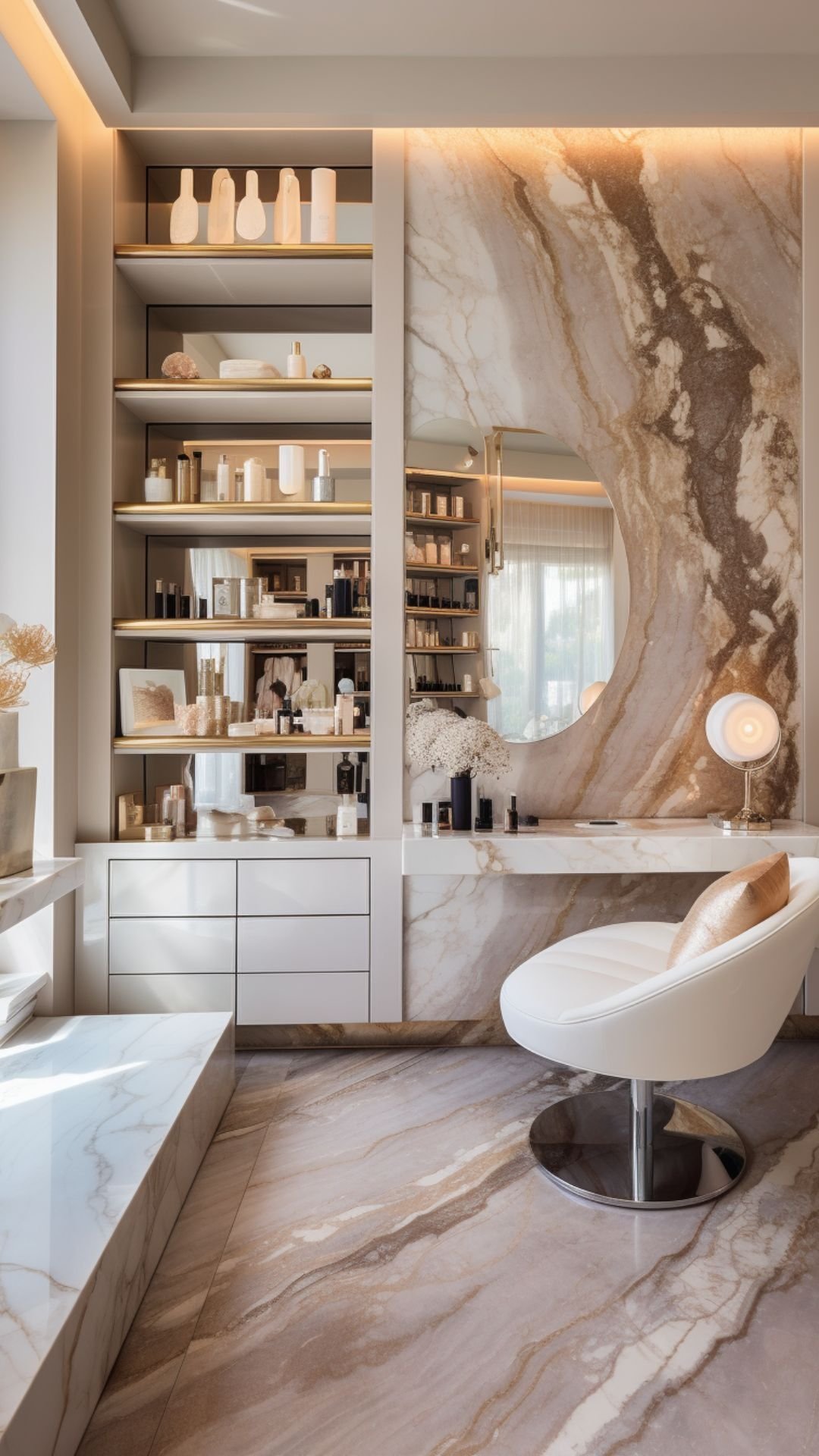
Beige, Cream, and Warm Stone Colors
Beige, cream, and warm neutral stone colors are widely used in hospitality, restaurants, wellness spaces, luxury apartments, and residential-style commercial interiors. They create comfort, softness, and approachable luxury. These tones are particularly effective when paired with warm LED lighting, bronze metal, oak wood, or textured wall finishes.
Buyers should pay attention to undertones. Some cream stones may turn yellow under warm lights. Some beige surfaces may look pink or grey depending on surrounding finishes. Always review samples under project lighting, not only under office fluorescent lights that make everything look like a tired spreadsheet.
Black and Dark Stone Colors
Black and dark stone colors create drama, luxury, and strong contrast. They are effective for reception desks, bar counters, retail display tables, feature walls, and brand statement areas. Dark surfaces can make metallic details, lighting lines, and product displays stand out.
However, dark stone can show dust, fingerprints, water marks, and fine scratches more easily depending on finish. Polished black surfaces feel luxurious but may require more visible cleaning. Matte black surfaces feel modern but may show oils differently. Buyers should confirm maintenance expectations before choosing dark colors for high-touch surfaces.
Green, Blue, Red, and Bold Brand Colors
Bold color stone surfaces can create memorable brand spaces. Green may support wellness, boutique luxury, or natural identity. Blue can communicate calm, technology, or ocean-inspired branding. Red or burgundy can create energy and hospitality drama. These colors work well as accents, feature walls, counters, or brand zones.
For large floors or multi-location projects, bold colors must be handled carefully. A strong color that looks exciting in a sample can feel overwhelming across 300 square meters. If the brand color is powerful, consider using it as a controlled accent rather than covering every surface like the brand exploded indoors.
| Brand Emotion | Recommended Stone Color Direction | Best Application | Buyer Warning |
|---|---|---|---|
| Clean and premium | White, ivory, off-white, soft marble-look | Hotels, clinics, salons, luxury apartments | Check stain visibility and cleaning routine. |
| Calm and corporate | Light grey, warm grey, taupe grey | Office lobbies, reception desks, meeting areas | Avoid making the space feel too cold. |
| Warm and welcoming | Beige, cream, warm white, light travertine tones | Hotels, restaurants, wellness spaces | Review under warm lighting to avoid yellow cast. |
| Luxury and dramatic | Black, charcoal, deep brown, dark green | Retail counters, bar tops, feature walls | Dust and fingerprints may be more visible. |
Material Options for Custom Stone Color Matching
Natural Marble and Quartzite
Natural marble and quartzite offer unique veining, depth, and geological authenticity. They are suitable for luxury projects where natural variation is part of the design language. Marble can create softness and classic luxury, while quartzite often offers stronger hardness and dramatic movement.
The limitation is color control. Natural stone can be selected, sorted, and approved by slab range, but it cannot be manufactured to match a Pantone color exactly. If a project needs multi-location consistency, natural stone may require stricter slab approval and extra reserve material.
Engineered Quartz and Pure Color Quartz
Engineered quartz can provide stronger color consistency and more controlled surface appearance. Pure color quartz is especially useful when brands need clean, minimal, repeatable surfaces for countertops, reception desks, kitchen islands, vanity tops, or commercial counters. It allows designers to create a controlled identity without relying on unpredictable natural veining.
If the brand needs a stable white, beige, grey, or custom neutral tone, engineered quartz is often easier to standardize. Buyers should confirm slab size, thickness, finish, resin quality, color range, stain resistance, and batch consistency before ordering.
Terrazzo and Aggregate-Based Surfaces
Terrazzo offers strong customization through base color, aggregate color, chip size, stone fragments, glass pieces, and polishing level. It is useful for branded floors, feature walls, retail spaces, and artistic commercial interiors. A brand can use terrazzo to echo corporate colors in a more subtle, material-rich way.
However, terrazzo color matching depends on base material, aggregate selection, chip distribution, polishing depth, and sealing. Mockups are essential. A small sample may not represent the full floor, especially when aggregate size or distribution is part of the design.
Porcelain and Sintered Stone
Porcelain and sintered stone offer controlled colors, large formats, strong surface performance, and many printed designs. They are often used for commercial walls, floors, countertops, and furniture surfaces. They can provide consistent visual results, but edge details may differ from full-body or through-body materials.
If the project includes exposed edges, stair returns, thick countertop profiles, or integrated furniture details, buyers should confirm the body color and edge treatment. This is especially important when the surface pattern is printed only on the top layer.
| Material Type | Color Control Level | Visual Depth | Best Use | Buyer Recommendation |
|---|---|---|---|---|
| Natural marble | Low to medium | Very high natural depth | Luxury interiors and feature areas | Approve full slabs and variation range. |
| Engineered quartz | High | Medium to high | Countertops, vanities, reception desks | Choose for repeatability and easier color control. |
| Terrazzo | Medium to high | Custom aggregate depth | Brand floors, walls, artistic surfaces | Request mockups and aggregate samples. |
| Porcelain or sintered stone | High | Depends on printing and body structure | Floors, walls, counters, commercial panels | Check edge appearance and slip rating. |
How Custom Stone Color Matching Works
Step 1: Define Brand Color and Design Mood
The process should start with brand identity, not random stone browsing. Buyers should provide brand color references, design mood boards, project renderings, lighting temperature, furniture materials, metal finishes, wall colors, and application zones. A Pantone number can help, but stone is not paint. Texture, mineral movement, gloss, and depth affect how color is perceived.
For example, a warm beige quartz may look elegant under 3000K hotel lighting but appear slightly yellow under warmer decorative lighting. A cool grey surface may look clean in daylight but too cold under white LED. Designers and suppliers should discuss how the color will live inside the real space.
Step 2: Choose the Right Material System
If exact repeatability matters, engineered quartz, pure color quartz, porcelain, sintered stone, or terrazzo may be better choices. If natural luxury matters, marble or quartzite can be selected with slab range approval. If exposed edges matter, full-body or through-body materials should be considered. If the surface will be used in high-traffic or wet areas, performance data must be reviewed together with color.
For projects that involve more than stone alone, buyers can explore other custom stone surface options to coordinate supporting materials, accessories, or related surface solutions around the main color concept.
Step 3: Sample Development and Approval
Physical samples are essential. Digital renderings help with concept, but real material approval should involve physical samples, full slab photos, finish samples, and lighting review. Buyers should inspect the material under warm light, cool light, daylight, and camera exposure when possible.
The right approval standard is not “one perfect sample.” The better approach is approving an acceptable range. This includes base color, vein movement, finish, gloss level, edge appearance, and batch tolerance. If the project is large, request batch photos before cutting or shipping.
Step 4: Batch Control and Production Confirmation
For commercial projects, batch control is not optional. Buyers should request slab numbering, batch photos, dry layout if needed, cut-to-size drawings, packing photos, inspection records, and reserve material planning. If the project may need future repairs or expansion, extra slabs should be ordered or reserved from the same batch.
Technical Parameters Buyers Should Confirm
Color Tolerance and Lighting Conditions
Color can shift under different lighting temperatures. A surface may appear warmer under 3000K lighting and cooler under 5000K lighting. Gloss level also affects perceived color. Polished surfaces reflect more light and may look deeper, while matte surfaces may look softer and flatter. In engineered surfaces, color difference may be measured using ΔE values in some cases, but visual approval remains important because stone is a textured material.
Finish, Gloss, and Texture
Polished finishes appear richer and more reflective. Honed finishes feel softer and more understated. Matte finishes reduce glare but may show oils or fingerprints differently. Textured finishes can improve slip resistance but may require different cleaning methods. The finish should match both brand mood and practical use.
Thickness, Slab Size, and Edge Appearance
Common thickness options may include 12mm, 15mm, 18mm, 20mm, and 30mm depending on the material. Large slabs reduce seams and support premium design, but they require careful logistics and installation. Countertops, reception desks, stairs, and wall returns need edge planning. If the edge is visible, confirm whether the material body matches the surface color.
| Parameter | Why It Matters | Common Buyer Check | Risk if Ignored |
|---|---|---|---|
| Color tolerance | Controls brand consistency | Approve sample range and batch photos | Visible mismatch between areas or locations |
| Gloss level | Changes perceived color and mood | Compare polished, honed, matte, and textured finishes | Wrong visual effect under lighting |
| Water absorption | Affects stain risk and maintenance | Request test data where available | Staining or cleaning difficulty |
| Slip resistance | Important for flooring and public areas | Confirm finish and local safety requirement | Wet-zone safety risk |
Custom Stone Color for Different Commercial Spaces
Hotel Lobbies and Reception Areas
Hotels need warmth, luxury, and durability. Stone color should match lighting, furniture, metal finishes, wall panels, and brand positioning. Warm beige, soft white, dramatic black, and grey marble-look surfaces are common choices. For reception desks, the color must look premium from both close view and distance.
Retail Stores and Flagship Brands
Retail spaces use stone color to support product storytelling. Luxury brands may use black, white, beige, or bold accent colors. Beauty brands may prefer clean white, soft cream, or muted pink tones. Technology brands may prefer grey, black, or cool neutrals. Repeatability matters for multi-store rollouts because customers should recognize the brand environment across different locations.
Restaurants, Cafes, and Bars
Food and beverage spaces need both mood and practicality. Bar tops, dining counters, restroom vanities, and service counters face stains, water, cleaning chemicals, and high touch frequency. Darker or warmer tones may hide wear better, while light surfaces can create cleanliness and brightness. Chemical resistance, stain resistance, and cleaning compatibility should be checked.
Office and Corporate Interiors
Corporate spaces often use grey, white, beige, and muted tones to communicate stability and professionalism. Reception desks, wall panels, meeting tables, and pantry counters should feel consistent with the company’s visual identity. For offices, stone color should support the brand without becoming distracting.
Healthcare, Wellness, and Beauty Spaces
Healthcare, wellness, and beauty spaces need clean, calm, and hygienic color palettes. White, cream, light grey, soft green, and warm neutrals are common. Buyers should consider low-emission documents, easy cleaning, stain resistance, and a surface mood that feels reassuring rather than clinical.
Custom Stone Color vs. Standard Stone Selection
When Custom Color Matching Is Worth It
Choose Custom Stone Color when brand identity is strict, project visibility is high, multiple locations need consistency, or the design mood is unique. Custom color is especially valuable for reception desks, hotel lobbies, flagship stores, branded counters, feature walls, showrooms, and commercial focal points.
When Standard Stone Colors Are Enough
Standard colors may be enough for back-of-house areas, budget-sensitive projects, low-visibility spaces, utility counters, or interiors that do not require exact brand matching. Standard stock may reduce lead time and simplify procurement. The smart decision is not always “custom everything.” Sometimes standard material in the right place saves time, cost, and stress.
| Project Situation | Choose Custom Stone Color? | Reason | Recommendation |
|---|---|---|---|
| Flagship retail store | Yes | High brand visibility | Use controlled samples and batch approval. |
| Hotel chain lobby | Yes | Repeat identity across locations | Build a material standard library. |
| Back-of-house utility area | Usually no | Low visual importance | Choose standard durable material. |
| Restaurant bar counter | Often yes | High-touch brand focal point | Check stain and chemical resistance. |
Industry Trends in Brand-Aligned Stone Surfaces
Branded Interiors Are Becoming More Consistent
Commercial brands increasingly want recognizable interiors across locations. Stone color is part of that system. Flooring, reception counters, wall panels, display areas, vanity tops, and bar counters are no longer isolated design decisions. They work together as brand signals.
Engineered Surfaces Are Supporting Better Color Control
Engineered quartz, pure color quartz, porcelain, sintered stone, and terrazzo are becoming more popular because they offer stronger repeatability than many natural stones. This matters for multi-location projects and commercial rollouts. Natural stone remains valuable when uniqueness is part of the brand story, but controlled surfaces often win when repeatability matters more.
Warm Minimalism and Natural Luxury Are Growing
Commercial interiors are moving from cold minimalism toward warm neutrals, soft veining, natural textures, and calm luxury. Custom Stone Color helps brands create this mood while maintaining surface consistency. The best designs feel natural but still controlled. A little warmth, a little texture, and no visual chaos—designers sleep better that way.
Regulations, Safety, and Documentation
Indoor Environmental Requirements
Commercial projects may require low-VOC documents, material declarations, or green building support depending on the region and project type. Engineered materials may require resin, emission, or safety documentation. Buyers should ask suppliers for available test reports before final approval.
Slip Resistance for Flooring Applications
If Custom Stone Color is used for flooring, slip resistance matters. Polished surfaces may not be suitable for wet entrances or public spaces with heavy moisture exposure. Finish choice should match local safety requirements, traffic level, and cleaning plan.
Food Contact and Hygiene for Counters
Restaurant counters, bar tops, food-service surfaces, and hospitality vanities need hygiene, stain resistance, and cleaning compatibility. Buyers should confirm whether the chosen material is suitable for the intended use and whether cleaning chemicals may affect the finish over time.
Common Mistakes in Custom Stone Color Projects
Mistake 1: Approving Only a Small Sample
Small samples may not show full slab movement, batch variation, or real project appearance. Buyers should approve full slab photos, physical samples, and acceptable variation ranges before production.
Mistake 2: Ignoring Lighting
The approved color may look different under final project lighting. Samples should be reviewed under warm light, cool light, daylight, and project lighting whenever possible.
Mistake 3: Expecting Natural Stone to Match Like Paint
Natural stone has geological variation. Buyers should use natural stone when variation is acceptable and engineered stone when repeatability matters. Expecting marble to behave like paint is a fast ticket to disappointment city.
Mistake 4: Forgetting Edge Details
Counter edges, stair edges, wall returns, and thick profiles may reveal pattern limitations. Buyers should confirm full-body, through-body, or surface pattern structure before fabrication.
Mistake 5: Choosing Supplier by Price Only
Low price can hide weak color control, poor batch matching, unclear samples, surface inconsistency, and project delays. Buyers should choose a supplier with sample support, batch control, project documentation, and export packing experience.
How to Choose a Reliable Custom Stone Color Supplier
What a Professional Supplier Should Provide
A professional Custom Stone Color supplier should provide physical samples, full slab photos, batch range confirmation, color matching discussion, material options, finish options, thickness options, edge detail support, cut-to-size drawings, dry layout support, production timeline, packing photos, inspection reports, maintenance guidance, export documentation, and after-sales communication.
Supplier experience matters because color matching is both a design issue and a production issue. Buyers can review Miyastone custom stone surface supplier capability when evaluating project support, material selection, slab control, and commercial communication experience.
Manufacturer vs. Supplier vs. Wholesale Buyer Logic
If you need new color development, choose a manufacturer or factory with production control. If you need project sourcing, choose a supplier with material selection capability. If you need container-level supply, compare Custom Stone Color wholesale options but verify consistency. If you need chain-store rollout, prioritize repeatability and standardization. If you need natural stone uniqueness, prioritize slab selection and range approval.
For project discussion, buyers can contact Miyastone with brand color references, project photos, application area, finish preference, slab size, edge details, and timeline. A clear brief helps the supplier recommend realistic material options instead of guessing, and guessing is not a specification method. It is just hope wearing a hard hat.
Recommended Buyer Checklist Before Ordering
| Checklist Item | Why It Matters | Buyer Action |
|---|---|---|
| Brand color reference | Guides color matching direction | Provide Pantone number, physical sample, or approved mood board. |
| Project lighting | Changes perceived color | Review samples under final lighting conditions where possible. |
| Material type | Determines color control and variation | Choose engineered quartz for repeatability or natural stone for uniqueness. |
| Edge detail | Affects visible color and pattern continuity | Confirm full-body, through-body, or surface pattern structure. |
FAQ
1. Can stone surfaces be matched to a brand color?
Yes, stone surfaces can be selected or engineered to align with brand colors, but the level of accuracy depends on material type. Engineered quartz, terrazzo, porcelain, and sintered stone usually offer better repeatability than natural stone. For accurate results, buyers should provide physical color references, lighting information, finish preferences, and application details before sample approval.
2. Is Custom Stone Color possible with natural marble?
Custom Stone Color is possible with natural marble in the sense that slabs can be selected by color range, tone, and veining style. However, marble cannot be controlled like paint because each slab has natural geological variation. Buyers should approve full slabs, acceptable variation ranges, and dry layouts when using natural marble for brand-sensitive projects.
3. What material is best for strict color consistency?
Engineered quartz, pure color quartz, porcelain, sintered stone, and terrazzo are usually better choices for strict color consistency and repeat projects. These materials can offer stronger production control than many natural stones. Natural stone is better when unique veining and geological character are part of the design goal rather than a color matching problem.
4. How do buyers avoid color mismatch in stone projects?
Buyers can avoid color mismatch by using physical samples, full slab photos, batch approval, lighting review, finish confirmation, dry layout when needed, and clear acceptable variation standards. They should avoid approving color only from digital images because screens, lighting, gloss, and surface texture can all change how stone color appears.
5. What should be checked before ordering custom stone surfaces?
Before ordering custom stone surfaces, buyers should check material type, brand color reference, finish, gloss level, thickness, slab size, edge appearance, pattern depth, color tolerance, batch consistency, performance data, installation conditions, maintenance requirements, documentation needs, packing method, lead time, and supplier project support.
References
1. The Interior Design Reference & Specification Book — Chris Grimley and Mimi Love — Rockport Publishers.
2. Color, Space, and Style: All the Details Interior Designers Need to Know — Chris Grimley and Mimi Love — Rockport Publishers.
3. Stone in Architecture: Properties, Durability — Siegfried Siegesmund and Rolf Snethlage — Springer.
4. Dimension Stone Design Manual — Natural Stone Institute — Commercial Stone Design Guidance.
5. Time-Saver Standards for Interior Design and Space Planning — Joseph DeChiara, Julius Panero, Martin Zelnik — McGraw-Hill.
6. Standard Test Methods for Absorption and Bulk Specific Gravity of Dimension Stone — ASTM International — ASTM C97.
7. Standard Test Method for Abrasion Resistance of Stone Subjected to Foot Traffic — ASTM International — ASTM C241/C1353 Reference Standards.
8. Colorimetry: Understanding the CIE System — Janos Schanda — Wiley-Interscience.
How Buyers Should Specify Custom Stone Color
How should buyers understand Custom Stone Color?
Custom Stone Color is the process of aligning stone or quartz surfaces with a brand’s visual identity, interior mood, and commercial use requirements. It is not only about choosing a beautiful color. It includes material selection, sample approval, lighting review, finish control, batch consistency, edge planning, and maintenance expectations.
Why does color matching matter for brand interiors?
Stone surfaces influence how customers experience a space. A hotel lobby, retail counter, restaurant bar, office reception wall, or luxury apartment kitchen can all communicate different brand emotions through color. Consistent surface color also helps multi-location brands maintain recognizable interiors across different projects.
What option should different projects choose?
If strict repeatability matters, choose engineered quartz, pure color quartz, porcelain, sintered stone, or terrazzo. If natural variation and unique luxury matter more, choose natural marble or quartzite with slab range approval. If exposed edges are visible, confirm whether the material is full-body, through-body, or surface-patterned. If the surface is used for flooring or food-service counters, performance data matters as much as color.
What should buyers consider before ordering?
Buyers should confirm brand color reference, Pantone or physical sample, project lighting, application area, material type, finish preference, gloss level, thickness, slab size, edge detail, pattern depth, natural or engineered preference, color tolerance, batch range, sample approval, cut-to-size drawings, maintenance method, safety requirement, documentation requirement, packing method, lead time, and supplier experience.
What is the practical recommendation?
Do not expect stone to behave exactly like paint. Use engineered materials when repeatability is the priority, and use natural stone when variation is part of the desired luxury effect. The best custom stone color project respects both brand strategy and material reality. Approve samples carefully, review lighting, confirm batch range, and document the specification before production.


